Wayfair (UK)

(Heuristic Evaluation)

We identified usability issues on the Wayfair (UK) website and addressed violations of Usability Heuristics, enhancing the user experience with improved UI and elements for seamless browsing.

About

E-commerce
UX Design

ROLE

UX Designer

TEAM

3 UX Designers

TOOLS

Figma, Zoom, Miro, Slack

Project Overview

What is Wayfair?

Wayfair is a prominent American e-commerce company specialising in the sale of furniture and home goods via website and app with delivery services spanning across the United States, Canada, Germany, and the United Kingdom.

Users were dropping off during browsing and checkout process

Wayfair's website ratings are consistently below 2 out of 5, primarily due to service-related challenges and recurring website usability issues. These factors negatively impact sales, user experience, customer satisfaction and trust in the brand.

Addressing these issues is critical to enhancing the overall user experience and improving customer perception of Wayfair's online platform.

Project Constraints

01. Paid Typeface
Wayfair uses a paid typeface "Sofia" which we did not have an access to. When redesigning, we replaced it with a similar and free typeface Poppins.
02. User Testing
We were not able to user test how well these improvements fare without access to the brand’s internal resources.
03. Technologies
New designs need to be compatible with existing technologies, may not allow for significant changes to the overall functionally.

Project Goals

1.  Enhance the user experience by creating a seamless and enjoyable shopping journey.
(This will build trust, improve brand perception, increase sales revenue, and foster long-term customer loyalty.)

​2.  Improve review ratings

Process

This project followed a linear design process. We were tasked with selecting a website or app for a heuristic evaluation to identify usability issues and improve the user experience.
SET OBJECTIVES

Elevating Sales Revenue with effective UX and UI Designs

Before initiating the Heuristic evaluation for UX review, we acknowledged that the primary objectives of an e-commerce business are to boost sales revenue and maintain customer loyalty. Therefore, our focus was on identifying and addressing usability issues encountered during the user journey of placing an order on Wayfair. This approach aimed to streamline the user experience and enhance customers' confidence in Wayfair.

Method

EVALUATION METHOD

Usability Heuristic Evaluation

We evaluated the website's usability based on a set of usability principles, then assessed issues based on their frequency, impact, and persistence, and ranked them according to severity.

Define

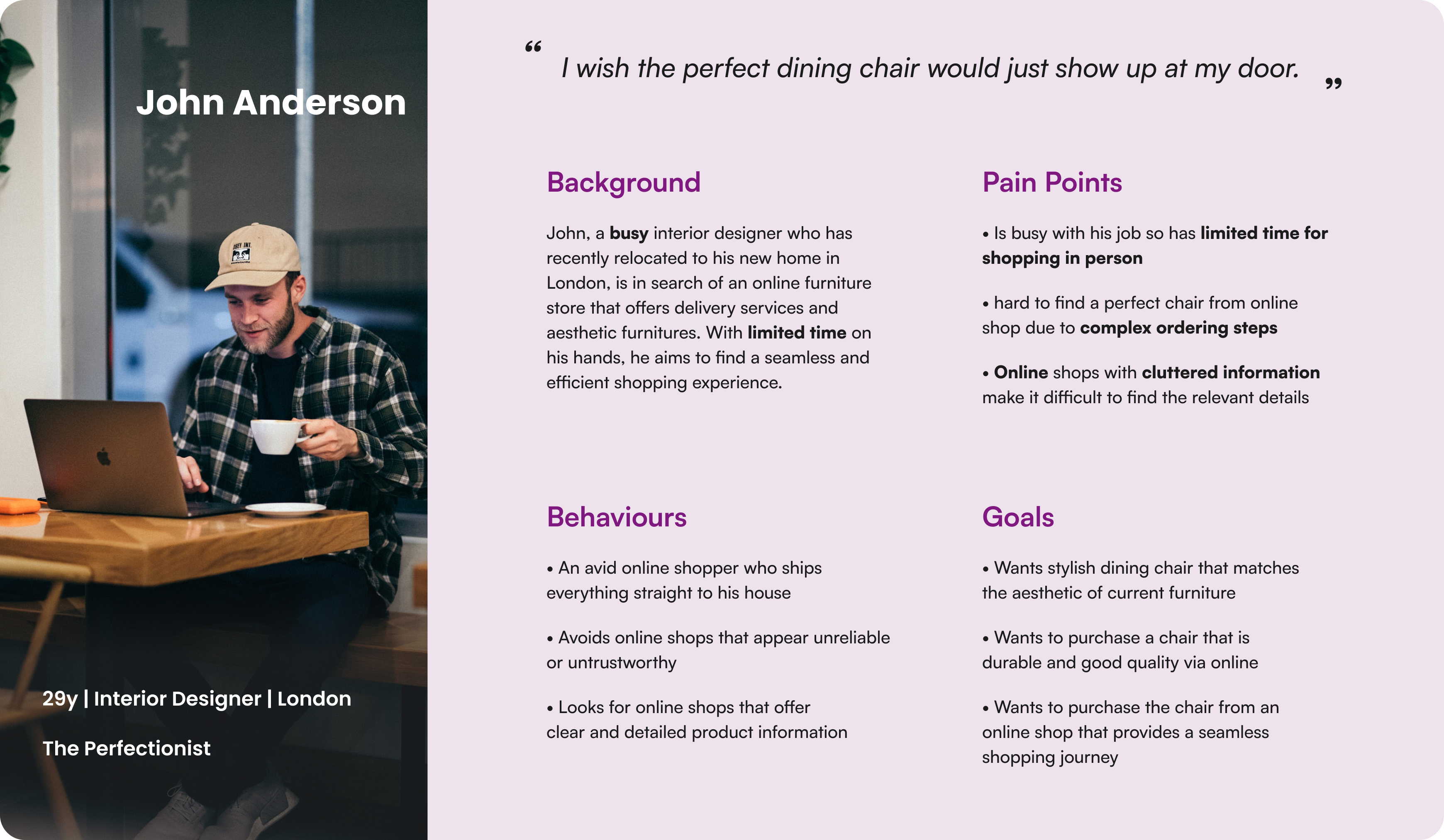
PERSONA

Busy users who wanted a seamless and straightforward shopping experience

Users turn to online platforms to purchase furniture, expecting a seamless and straightforward process. However, when faced with cluttered information, the process becomes overwhelming. Inconsistencies in design further diminish their trust in Wayfair, often prompting them to either explore Wayfair's e-commerce competitors or opt for offline stores.
USER TASK FLOW

Helping John to find and purchase a dining chair

To address users' pain points encountered during the purchase process, we outlined the steps users take from searching for products to placing an order. Through this analysis, we determined users' expectations for page content and identified usability issues on pages related to these steps.
PRIORITISATION MATRIX

Prioritising design improvements due to limited project time

After evaluating the browsing and checkout flow, we identified several usability issues that violated heuristics such as User Control and Freedom, as well as Consistency and Standards. With limited time, we created a prioritisation matrix to focus on improvements with high impact and low effort.

Evaluation & Solutions

#1 REDESIGN

Improving user control and freedom on the landing page

Prior to redesign, there was a violation of Usability Heuristic #3: User Control and Freedom
Before
  • The exit button was placed at the corner of the site where John could hardly notice.
  • John could have given up on shopping with Wayfair if he couldn’t find the exit button and didn’t want to sign up.
After
  • Relocated the exit button to within the email subscription card to increase its visibility.
  • Allowing John to easily exit this page and proceed to the next if he does not wish to sign up for emails.
#2 REDESIGN

Consistent Design for Price and Delivery Information Display

Prior to redesign, there was a violation of Usability Heuristic #4: Consistency and Standards on the search result page.
Before
  • Inconsistent Design for Price and Delivery Information Display
  • Inconsistency can erode trust between Wayfair and its customers, including John.
After
  • Implemented consistent fast delivery label design.
  • Increased font size for prices to aid comparison and build user trust.
  • Relocated price per item below the total price to improve information hierarchy.
#3 REDESIGN

Enhancing toggle flexibility and efficiency on search result page

Prior to redesign, there was a violation of Usability Heuristic #7: Flexibility and efficiency of use on the search result page
Before
  • The Fast Delivery Toggle was placed in between the product category section and style, John found it hard to notice.
  • John needed to filter the search again after turning on this toggle in the middle.
After
  • Relocated the toggle to the top of the filter section.
  • Allowing John to easily spot the toggle and turn it on if necessary before he filters the items in different styles that have a fast delivery option.
#4 REDESIGN

Improving information hierarchy with minimalist design on the product page

Prior to redesign, there was a violation of Usability Heuristic #3: User Control and Freedom during the checkout process.
Before
  • When John clicked to view the shopping cart on a Product Page, a shopping cart modal appeared on the right side with excessive text, making the experience overwhelming.
  • The distracting background images and information hindered John's ability to focus on the cart details.
After
  • Relocated the cart modal to the center of the page, creating a more prominent and focused position.​
  • Lightened the background to let John concentrate on the cart details he wants to view.
  • Only display necessary information within the card along with clear Call-To-Action buttons.
#5 REDESIGN

Improving user control and freedom during the checkout process

Prior to redesign, there was a violation of Usability Heuristic #3: User Control and Freedom during the checkout process.
Before
  • When John proceeded to checkout, he was asked to either sign in or create an account.
  • It posed a discouragement for John to proceed with the purchase as he was reluctant to create an account.
After
  • We added a guest checkout option so John can proceed without creating an account
  • Avoided discouraging new customers from purchasing.
#6 REDESIGN

Enhancing visibility of system status during loading

Prior to redesign, there was a violation of Usability Heuristic #3: User Control and Freedom during the checkout process.
Before
  • In order to proceed with the order, John created a new account but he couldn't see how far he was within the loading process due to a lack of clear indication.
After
  • Added a progress indicator to give John more visibility of the system status.
#7 REDESIGN

Removing redundant buttons on the checkout page

Prior to redesign, there was a violation of Usability Heuristic #3: User Control and Freedom during the checkout process.
Before
  • John had to click the 'Expand' button within the product details card on the right to view the product name and colour.
  • This button was unnecessary and inconvenient, as basic product details could have been displayed without requiring users to click on the buttons.
After
  • Removed the 'Expand' and 'Collapse' buttons within the product details card.
  • Allowing John to easily exit this page and proceed to the next if he does not wish to sign up for emails.

Key Learnings

KEY LEARNINGS

Brand Consistency, User-Centered Design, Teamwork

Brand Consistency
We recognised the cost implications of a complete style change and prioritised maintaining consistency with Wayfair's established brand identity. By adhering to the brand's visual elements, such as typography, colour scheme, and style, we ensured that the redesigned elements seamlessly integrated with the existing brand image and enhanced brand recognition and trust.
User-Centered Design
By considering user needs and preferences, conducting evaluations, and implementing improvements based on usability principles, we enhanced the overall user experience and ensured that the redesigned website met user expectations.
Teamwork
Despite varying levels of contribution, we embraced the situation positively and focused on leveraging each other's strengths. Through open communication and mutual support, we successfully completed the redesign project, highlighting the importance of collaboration and adaptability in achieving our goals.
Thank you for stopping by.