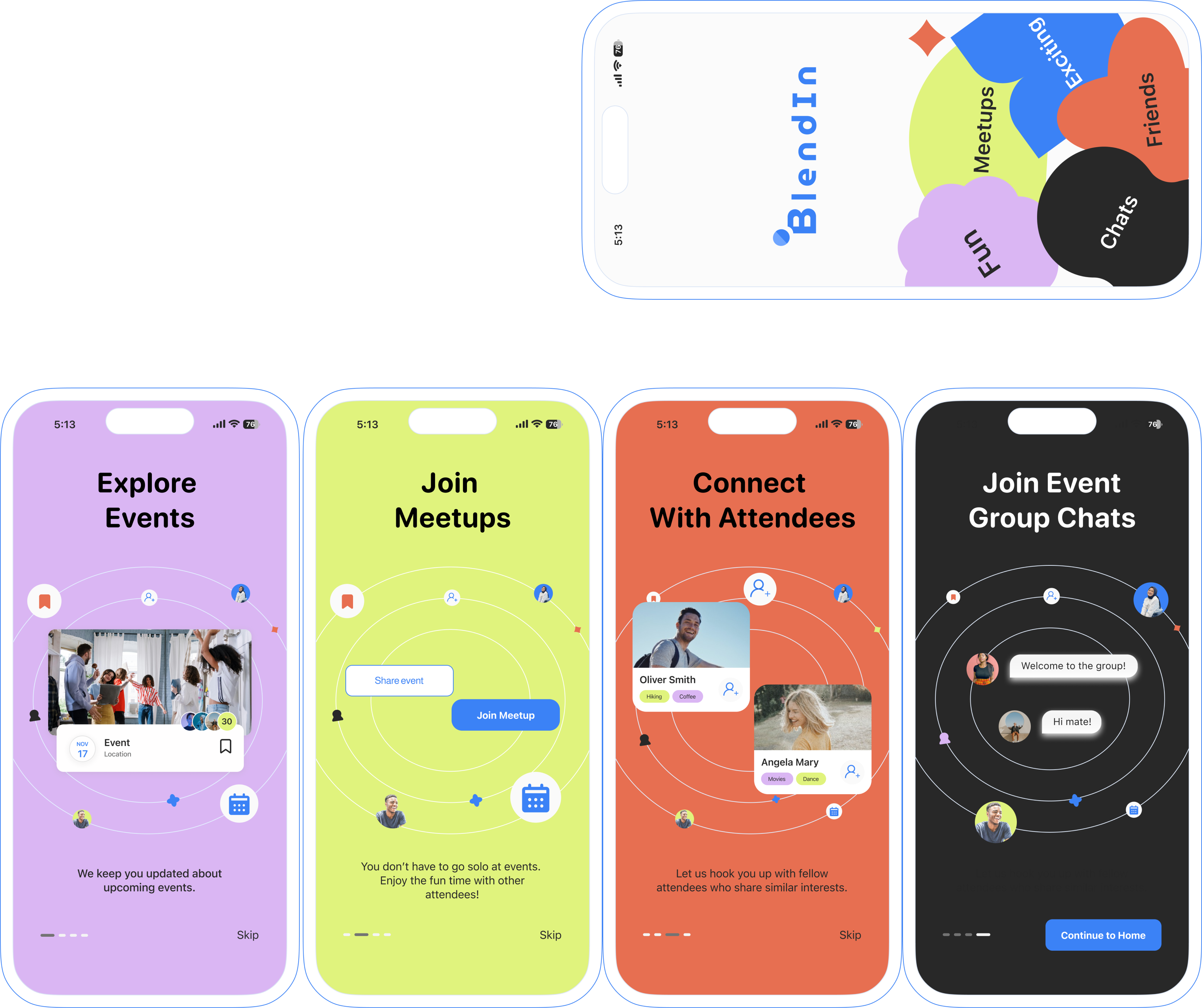
that connects over 278k young UK immigrants, helping them find like-minded friends to explore local festivals and tackle cultural challenges.
Although the design process may seem linear at a glance, there was a lot of iteration and revisiting of earlier stages throughout.
This aimed to create a better user experience that truly addresses users' pain points and helps them reach their goals.
Quantitative research
USER INTERVIEW
I interviewed 10 young immigrants to understand the immigrants' challenges and identify opportunities to improve their integration experience.
COMPETITIVE ANALYSIS
I compared the functionality of the leading meetup apps, which helped me identify features I could incorporate into my design solution.
PERSONA
To ensure my design resonates with my target audience (young UK immigrants aged 25-35), I developed a user persona named Lucas. Based on user interview insights, Lucas embodies the key pain points, goals, and motivations of my target users.
USER JOURNEY MAP
Understanding user pain points, goals, and motivations, I mapped their current journey. This visual revealed the sequence of steps and pinpointed challenges. With these insights, I brainstormed solutions that address these hurdles at the right moment, empowering users to achieve their goals.
TASK FLOW DIAGRAM
Building upon the user journey map and identified opportunities, I created a task flow diagram. This visual roadmap outlines the key screens users will encounter, from event search to attendee connection. It ensures a smooth user experience by aligning the solution with the user journey at each touchpoint.
SKETCHES
With the user flow established, I began sketching potential features and necessary information for each screen. This rapid ideation process helped me brainstorm functionalities and ensure a smooth progression between screens.
LOW FIDELITY WIREFRAMES
Turning the chosen sketches of each screen into Low-fidelity wireframes allowed me to see how users interact with the interfaces and ensure clarity of primary CTAs at each step before user testing.
UsaBILITY TEST
Test result
To identify potential usability issues and refine the user experience, I conducted two rounds of usability testing with a total of 30 participants. This process yielded valuable feedback that informed further improvements.
PRIORITISATION MATRIX
With a wealth of user feedback in hand, but limited project time, I created a prioritisation matrix. This tool helped me identify the most impactful changes for the user experience, focusing on adjustments that offered high impact with minimal development effort.
PRIORITISATION MATRIX
User testing fueled this design's evolution. These prototypes showcase the journey, with the initial iteration on the left and the final, improved version on the right. Each change reflects valuable insights gathered from user feedback.
design system
Many users initially feel isolated and out of place when adapting to a new culture, therefore, I prioritised user experience by incorporating a bright and positive colour palette to create a welcoming and approachable atmosphere and utilised a familiar typeface commonly used in iOS.
KEY LEARNINGS
NEXT STEPS